The challenge
Scotiabank had a severely outdated, slow, and inaccessible mobile web solution on a vendor-driven platform without any upgrade path. The mobile web site was on its last legs, and it needed to be replaced.
I worked as the lead UX Designer and product owner on this project.
The approach
We had a rare "greenfield" opportunity in an organization as large as Scotiabank. We had to build a new platform from scratch in an ecosystem of outdated infrastructure, implement a new design system, and we were the first cross-functional agile team ever in the bank. We all got Scrum certification, co-located in a new office space, and did our best to do development “by the book”. While we had a great degree of freedom, thanks to our relatively small size and our executives shielding the team from distraction, there was little appetite for wholesale change to the core feature set for day-to-day banking activities that we had established in our other digital products.
We responded to this by taking our basic feature set and working to improve it in three ways:
- A new design system based on human-centric information design and architecture derived from actual customers' mental models of banking
- Accessibility and inclusive design
- Performance, even on older devices
Given that we did not have time or support to overhaul the experience of digital banking, we spent the early days of the project rethinking information hierarchy, and moving quickly through visual design concepts.
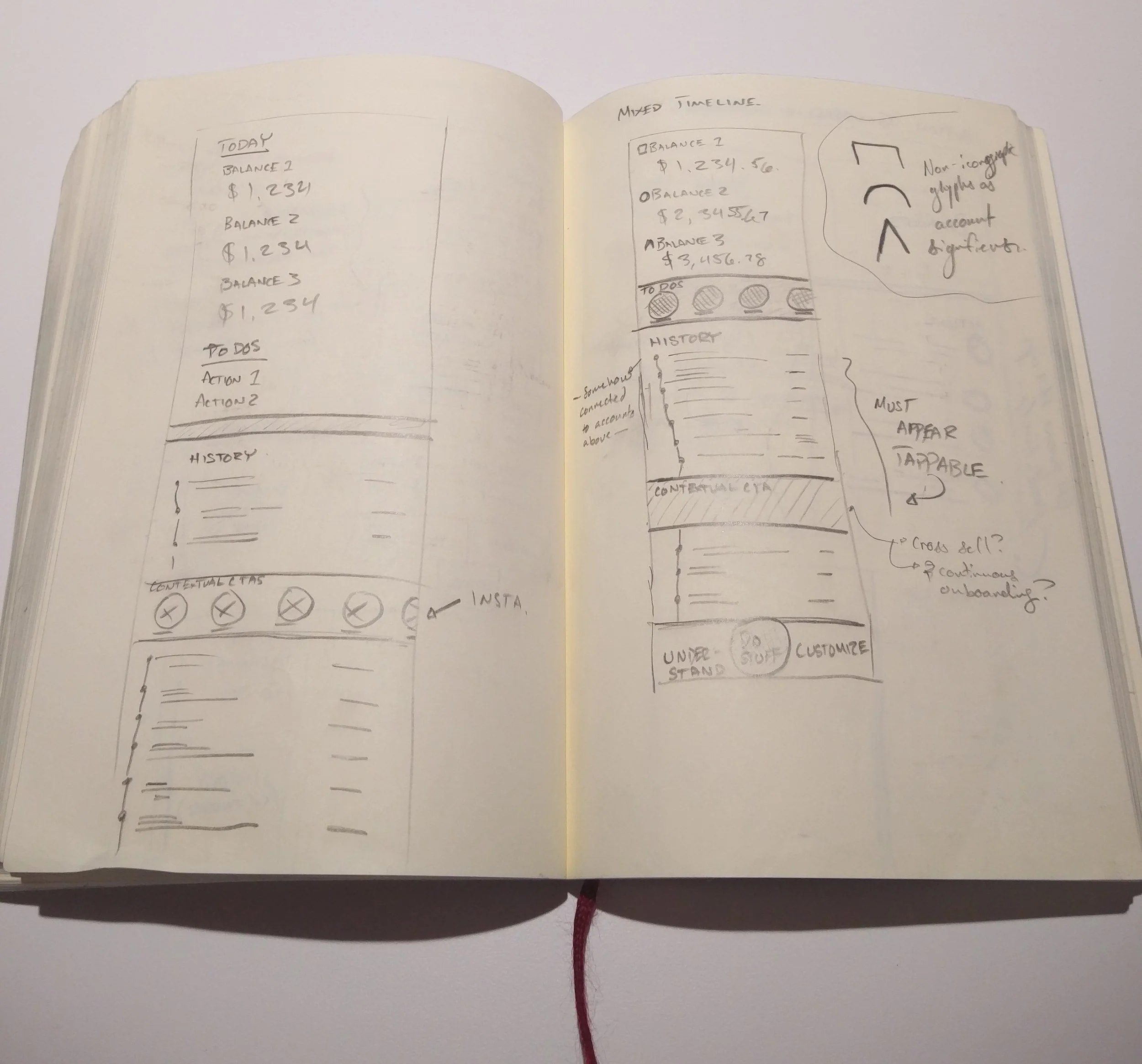
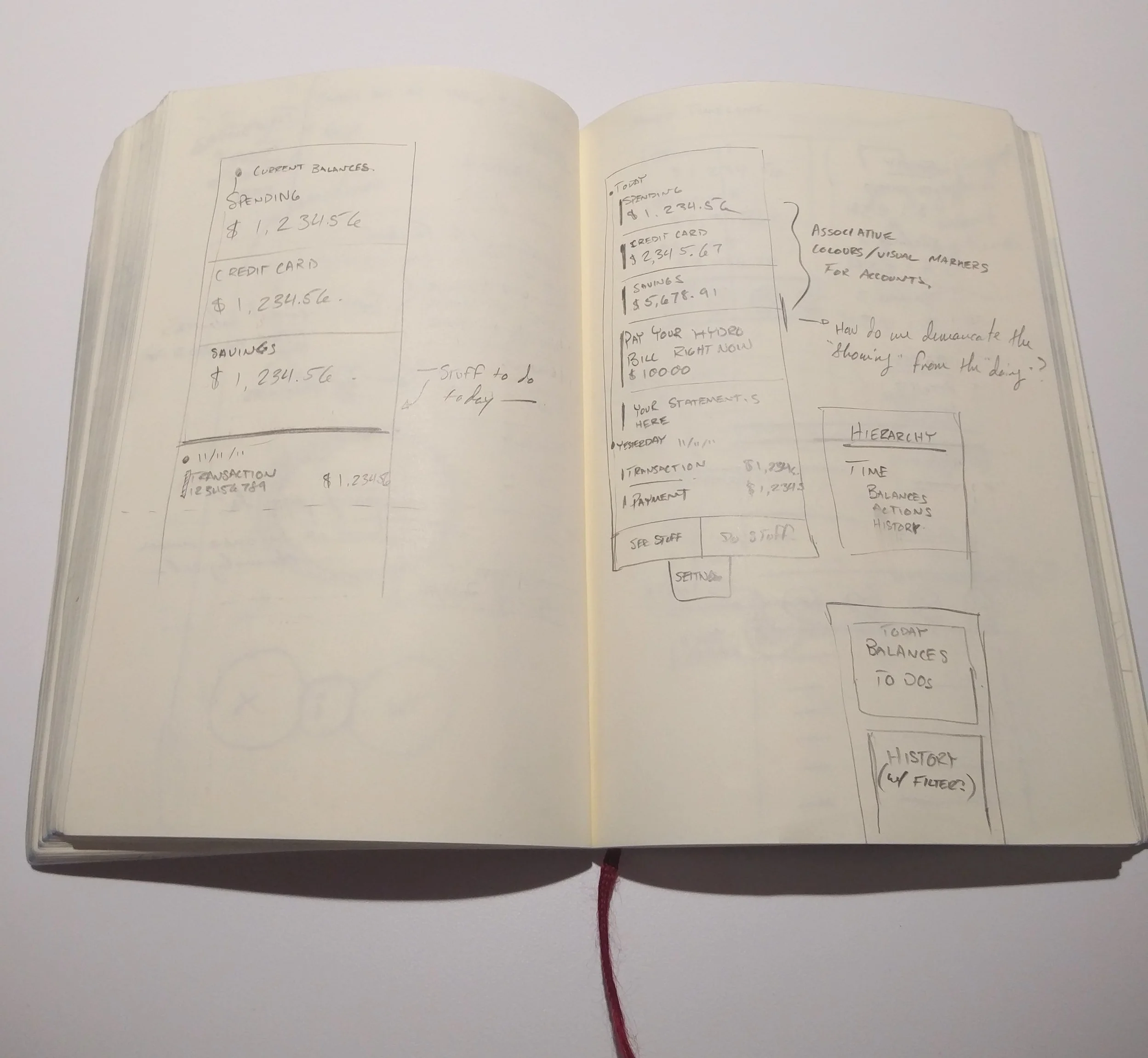
Rather than build a new design language in a vacuum, we moved as quickly as possible from pencil or whiteboard sketches to pixel-perfect screens. This let us organically derive an entire design by inventing, breaking, and tweaking elements in-context with developers. However, this approach had the drawback of preventing us from using a lot of "middle fidelity" deliverables like black and white wireframes.

An example from our style guide
The Solution
The end product is the first new platform the bank has delivered to customers in over 4 years, and the bank's only mobile product to ever take accessibility and responsive web design into consideration from the outset. It is also simple enough to run on older devices. Hundreds of thousands of people use Banking Web to complete basic transactions every day.

Before

After
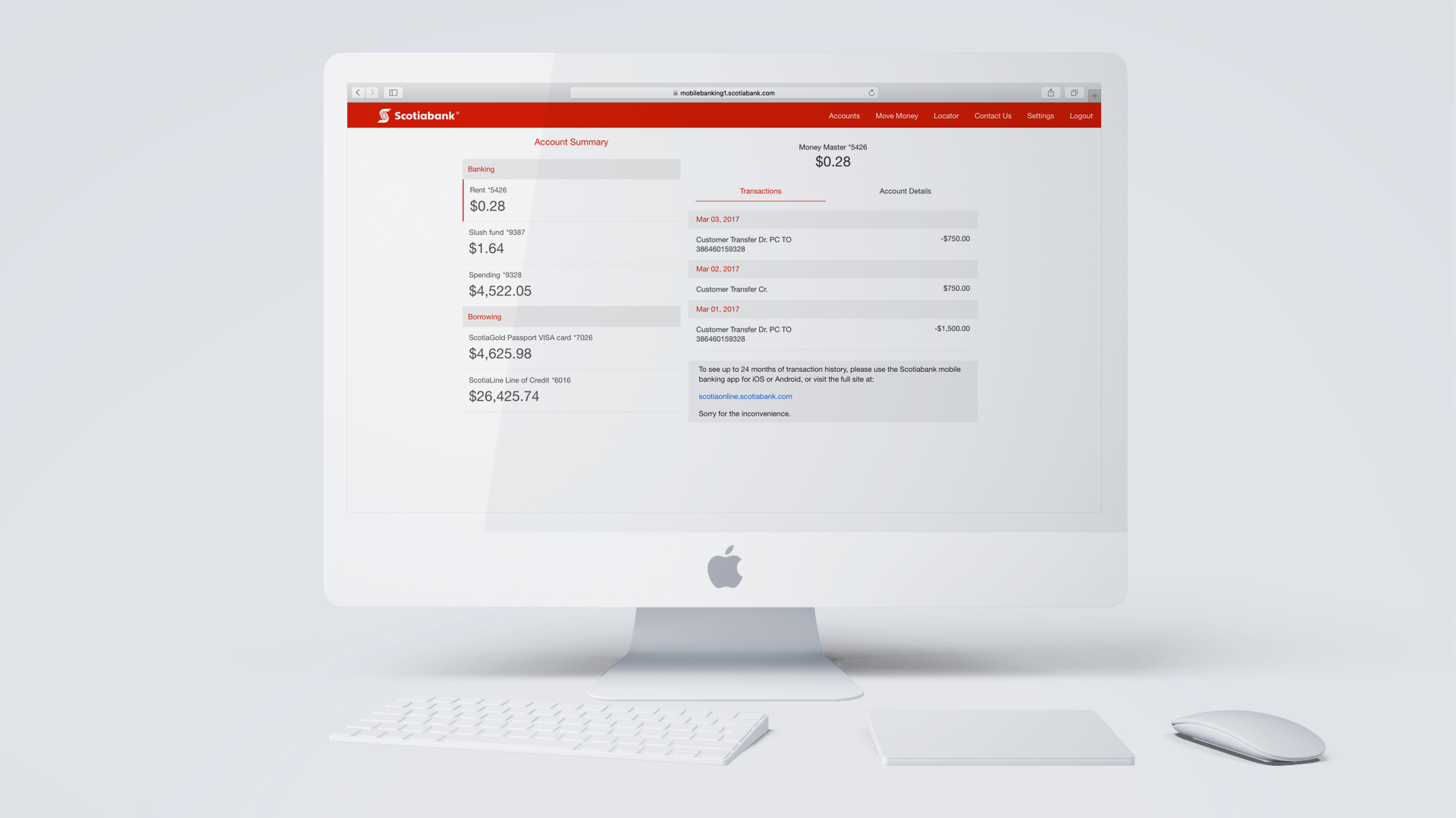
Balances
Our balances page (the first page a user sees when she signs into the site) is a good example of how we were able to improve on our legacy experience. The information hierarchy of the old experience prioritized the marketing-centric account names and the vague page title over primary account data. When we asked customers what the most important piece of data on this screen was in user testing sessions, the resounding majority said the balance took precedence over the name of their account, so we moved it up to the primary position in the information hierarchy. From a visual design perspective, we took a dingy, crowded interface filled with illegible text, unlabeled icons, and poor colour contrast and we cleaned it up.
We chose Lato as our typeface. At a glance, Lato has a similar presence and weight to Frutiger, except with rounded corners on the terminals, which gives it more warmth instead of a cold, modernist feel. Lato also has better web support than our brand fonts. We especially liked the dollar sign in Lato, which leans forward and seems to have a kind of momentum.
We also increased the tappable area of the account fields for users with poor motor coordination and/or thick fingers, and we bumped up the colour contrast of primary interface elements to comply with WCAG accessibility guidelines. The result is more readable, usable, accessible, and has a much more spacious feel.