
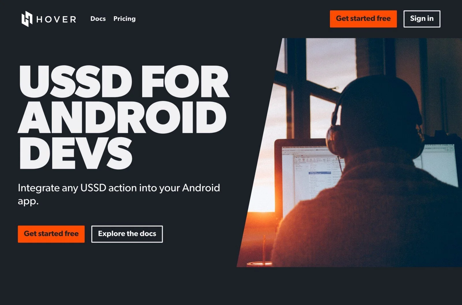
usehover.com
Android developer tools for financial inclusion
Tl;dr
I re-designed the visual identity and core product experience of usehover.com, as well as the Hover Dashboard based on insights from field research. The results made these user touchpoints more relevant and usable to the people who rely on them for their work.
The Challenge
Millions of people (especially in sub-Saharan Africa, South Asia, and Southeast Asia) use an outdated, difficult to use protocol from the 90s called "unstructured supplementary service data" (USSD) to access their money on a daily basis. Hover Developer Services created a new peice of technology that allows an app to perform USSD actions on a users behalf in the background of a typical Android application. Hover released this core tech as an Android SDK so that developers could build inclusive financial tools for their own communities. As a seed-stage startup, Hover focused on their core product offering in the early days. Without any dedicated design staff, they put the minimal viable amount of visual design and identity work into their original .COM site and dashboard. The result was loud, sunbursts of orange gradients and transparencies with skinny, poorly contrasting, difficult-to-read type. usehover.com site was also the home for our documentation, an essential component of any developer tool, and the docs didn’t get the love they deserved in the original designs.

The original designs for usehover.com
Approach
My first goal was to professionalize the site. This meant extending the brand and associated visual design, giving those design choices a firm conceptual foundation, and boosting the Content Performance Quotient of the site. Most of our devs work in their 2nd, 3rd, or 4th language when they code, and we couldn't localize all of our documentation, so I didn't want to waste their time with poorly structured content they didn't need. That meant prioritizing scannable, legible, well-structured documentation above all else.
We also conducted a two-week long field study in Accra and Nairobi to establish a foundation of understanding about the indie developers who relied on the SDK to create new apps.
We extended the new visual identity into the core features of the Hover dashboard, re-organized its information architecture, and created new tools to alleviate the primary pain points we uncovered during our research.
For the structure of usehover.com, we took a subtractive approach and simplified an already straightforward information architecture to include an intro page, technical documentation, pricing info, and a button to sign-up and login. That’s it.
I decided early on that this effort should extend the brand that already exists, rather than overhaul it from scratch. I kept the basic logo, and I used the oranges and Gotham display typeface as departures for the redesign. The reasons for this were twofold:
As a design team of one and a new member of the team living very far away from the the majority of our users, I wanted to have some more collaborators with more lived experience of our users’ day-to-day context on a greenfield rebranding.
We went to Accra and Nairobi for a foundational research study shortly after the redesign was done, and we wanted to learn more before we worked on the brand further.
The new landing page for usehover.com
Results
Concept: The all-nighter
One of the most fascinating aspects of working at Hover as a designer is the folks who use our products. The vast majority of our users are Android developers at early stage startups living in a sub-Saharan tech hub like Nairobi, Dar es Salaam, Kampala, Lagos, or Accra. I wanted to bring the focus of the brand back to the folks using the product. During some field research in Nairobi earlier this year, I got to interview several people involved in the tech scene there, and one of the many themes that came out of those interviews was the attitude of hustle, resourcefulness, and the willingness to take on many projects outside of a mainline full-time work. When I began to think about the devs using Hover, I imagined developers working on passion projects, side hustles, and new challenges in dark rooms late at night or early in the morning. I took the sunburst gradients and re-imagined them in this context as sunrises or sunsets over a metropolis like Nairobi.
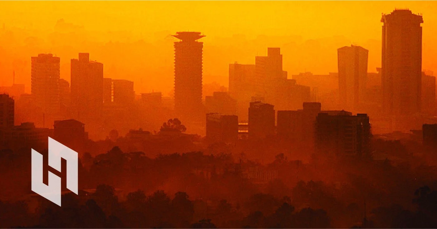
Sunrise over Nairobi
DOCS
There’s a reason dark themes are so popular these days, especially with developer tools. Devs working long hours in dark rooms are prone to eye strain and a massive external monitor beaming blue-ish white light into their eyes makes it worse. A dark theme helps ameliorate that problem. The dark theme also feels more technical and precise. When we went and met dozens of indie devs in Ghana and Kenya earlier this year, every single desktop we saw and every tool that could be customized with a dark theme had one.
Developers integrating new tools spend an ungodly amount of time flipping around between windows and browser tabs looking for snippets of code to integrate into their IDE of choice (in our case, usually Android Studio or VS Code with a dark theme). One of the goals we had for the technical documentation on the new .COM site was to reduce the perception of distance between the code samples in our docs and the destination code where the samples would eventually live, so we chose to use Solarized to theme the code in our docs. The folks who maintain Solarized have also done a tonne of work to maintain contrast and accessibility while retaining the syntax highlighting developers expect.

The Quick Start guide for the Hover Docs
Imagery
Given the size of the team and the resources we had at the time, I made the decision that the site would be very type-forward, and only have one brand-signalling image on the landing page. I am not a natural illustrator, and we did not have a library of excellent photography on hand at the time, and so I was unfortunately left with stock photography as a last resort.
I began by playing with some more technical images that contained the dark-with-orange-sunburst colour schemes that would harmonize with the rest of the site.

Some generic tech shots from Unsplash and Adobe Stock
These types of images felt particularly vacant, though, even for stock photography. All they say is, “We make something technical and we know what orange looks like.” Hardly an inspiring brand promise. I went back to the all-nighter concept and began to look for imagery that depicted the folks you might find in a co-working space, cafe, or startup incubator in one of the tech scenes where our developers live.

Candidates for our indie dev hero image
Bringing forward the daily lived experiences of the indie devs who use Hover all over the world became a bigger part of our product focus and our brand. Eventually I settled on this image by Simon Abrams on Unsplash, a young tech worker with headphones on (another ubiquitous dev habit) in silhouette working as the sun rises in the distance.

An image for indie devs
Type
I knew I wanted to replace Lato Thin that the previous designer had used as a body typeface and replace it with an extremely legible serif typeface for our documentation. After combing through lookbooks and consulting the indispensable Typewolf Guides, I landed on Tisa Pro. It’s legible, has a high x-height, scans well, and plays well with Gibson, the web-servable, Gotham-esque typeface I chose to replace Gotham as our display typeface. Like Tisa, Gibson is super versatile, and can be used for non-paragraph body copy, like tables, and code samples. Gibson also has a nice, chunky bold face that I love for creating big, structural headers on our top-level pages.

Gibson Bold

Tisa and Gibson in the Hover Dashboard
Parsing
One of the consistent pain points we found during our field research was the process of writing regular expressions (regex) to parse incoming SMS messages with transaction receipts so that developers could give feedback to their users about transaction statuses, success, and failure. Regex has a horrible, non-semantic, finicky syntax, and I have never met a developer in my career who enjoys writing it. In response to this pain point, we developed a semi-automated regex generator for the Hover Dashboard that let developers create perfect regex in seconds. Even with no background in computer science, I was able to generate flawless regex to parse transaction receipts in Swahili on my first try.

Hover regex generater