Wikipedia Dark Mode
The foundation of a reading experience for billions
Tl;dr
I led the design of dark mode for Wikipedia, one of the site's most requested features for years. Research suggested that readers' "eye strain" came less from reading than from multitasking in the dark. A visual design exercise quickly turned into a service design challenge because volunteers control page content. We designed tools to help them find, report, and fix pages that didn't work in dark mode. It launched to an enthusiastic response without significant complaints about broken pages.
The Challenge
For years, dark mode was one of the most requested features on Wikipedia. Readers and editors asked for it in community surveys going back to at least 2017, as well as in hundreds of comments during the rollout of Wikipedia's desktop redesign in 2022. The Wikipedia mobile apps already had a dark mode, but the website didn't. A few Foundation staff even built an experimental dark mode script, and it became a popular customization for engaged readers.
It sounds like a simple colour swap, but it wasn't. Volunteer editors control most of what appears on a Wikipedia page, including templates like infoboxes, navigation boxes, tables, and timelines. Many of those templates have colours hardcoded into them, which means that a dark mode implementation that simply swapped CSS variables could break millions of Wikipedia articles with no clear way to find out which articles needed fixing. We also could not simply invert the colours. Many articles use colour to carry meaning. For example, the political party colours in an election results table are extremely specific, and inverting them would remove information from the article. We also couldn't directly fix community-made templates. As a reuslt, a visual design exercise became a service design exercise. The core design problem wasn't "What will dark mode would look like?" It was "How might we support volunteer communities to fix dark mode bugs on their own pages?"
Dark mode was also a brand risk. Black text on a white background with blue links is as much a part of Wikipedia's brand as the "W" logo or the puzzle globe. Wikipedia has ignored plenty of internet trends over the years, so "everyone else has a dark mode" wasn't a good enough reason to implement the feature. I wanted to understand the root cause behind the requests for dark mode before we changed something so fundamental.
As the Lead UX Designer on the Web team, I led the design of dark mode. I researched why readers wanted it and designed ways for volunteers to find and fix pages that didn't work in dark mode. I also worked closely with the Codex design system team to build a systematic palette of dark mode colours.
Approach
What do readers mean by "eye strain"?
I started with what readers were telling us. In community survey requests, many heavy Wikipedia readers gave "eye strain" during night time reading as a reason for wanting dark mode. In a previous role, I'd heard the same thing from indie developers in Ghana and Kenya when I was designing developer tools. Nearly every developer I met used a dark theme.
Given the ubiquity of the "eye strain" complaint, I expected peer-reviewed HCI research to support it. I found the opposite. By most accessibility standards and in most studies, dark mode is worse for reading for people with typical or corrected vision. Light mode performed better on visual acuity and proofreading tasks, and it helped people read smaller type. In one study, its advantage even grew as the room got darker. Dark mode does help some smaller groups, like people with cataracts or light-sensitive migraines, but it makes reading harder for people with astigmatism, which is a much larger population.
The research didn't support dark mode as an accessibility intervention. It also had a blind spot: lab-based readability studies don't reflect all of the contexts where people actually read Wikipedia.
Context of use
So where was the "eye strain" coming from? I landed on two theories rooted in my understanding of Wikipedia readers' contexts of use.
The first is that dark mode is more about identity performance than reading performance. In the personal computing era, light text on a dark background implied command lines and "IT guy" tropes from popular culture. Dark mode projects an image of technical mastery. Choosing dark mode is, on some level, a small performance of "I'm good at computers." I think this is a completely legitimate reason for a dark mode interface.People have used tools to express identity for as long as there have been tools.
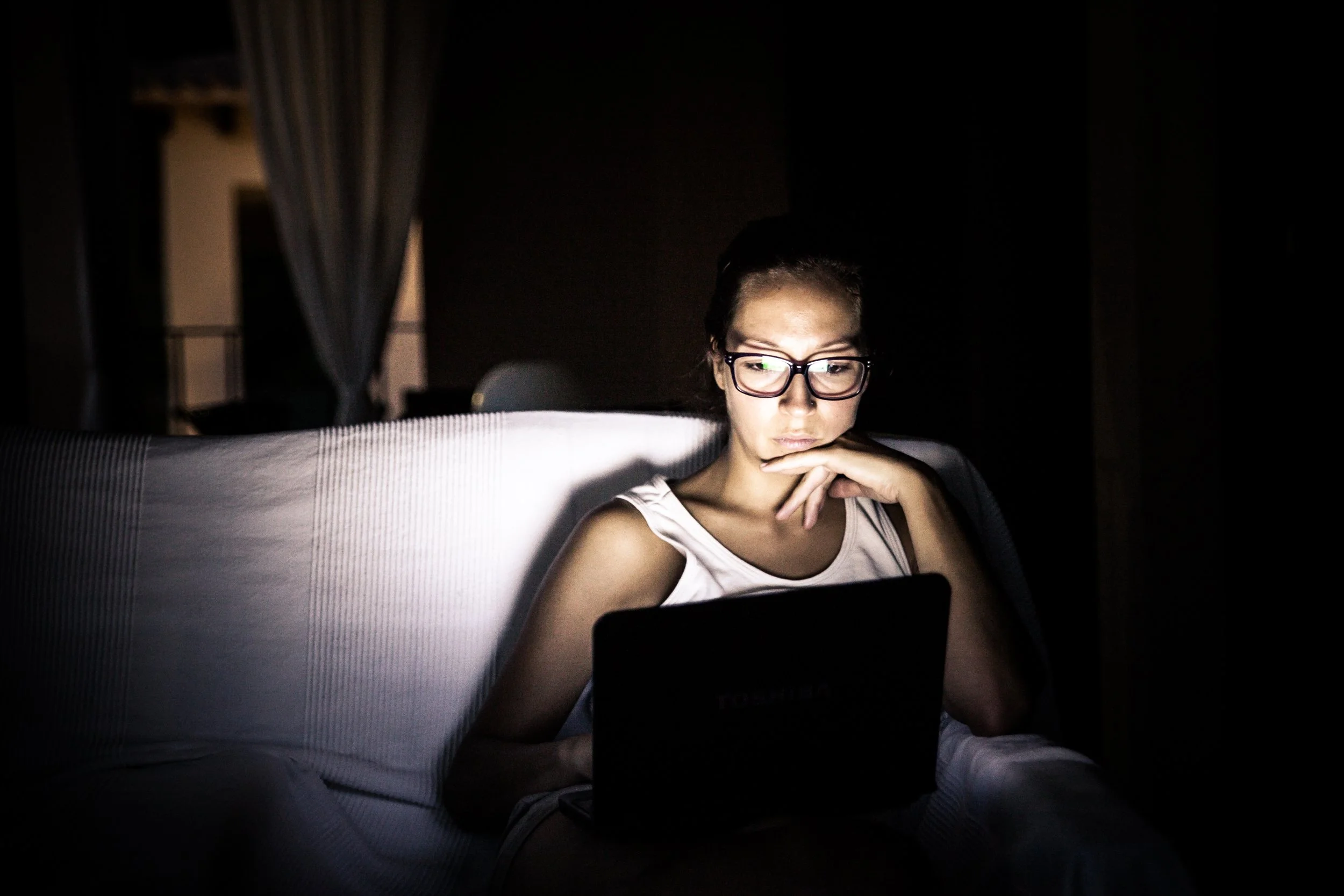
The second theory is more practical: people look at their phones in the dark, a lot. Wikipedia is a common "second screen" site, and a 2022 study found that Wikipedia "rabbit holes" are more likely at night. These are long, exploratory reading sessions. Opening a bright white page in a dark room is unpleasant, like having someone shine a flashlight in your eyes. If you're watching a dark movie while reading its Wikipedia article, your irises are adjusting over and over as your focus switches between screens. Dark themes may be worse for reading, but they are better for multitasking in dim surroundings.
I'm not an HCI researcher, and these theories need testing. But they gave us a better reason to build dark mode than "everyone else has one," and a clearer picture of who we were designing for.
From colour palette to service design
The design work happened at two levels. The first was the design system. I worked with the Design System team behind Codex to choose the colour variables for a systematic dark mode palette. The second was Wikipedia's actual content. A technical investigation showed us the scale of the risk: many, many templates used hardcoded background colours and semantic colours. This meant that the colours couldn't simply be inverted.
We couldn't fix templates ourselves, so the problem became a service design challenge: how might we make it easy for volunteers to make their pages work in dark mode?
Commons-based peer production, the model behind Wikipedia, works best when three conditions hold:
Tasks are discrete and modular.
Motivation is intrinsic.
Coordination costs are low.
Fixing one template on one page is already a discrete task. Wikipedians already have motivation and ways to recognize each other's work. The biggest barrier to preparing articles for dark mode was coordination: finding bugs, reporting them, and knowing how to fix them. That's where I focused my design effort.
Results
We shipped dark mode as a new option in Wikipedia's Appearance menu.
Find it, report it, fix it
Our research on peer production pointed to coordination as the biggest barrier for volunteers, so we designed for each step of the work:
Find it: An automatic colour contrast checker helps volunteers spot content that doesn't work in dark mode.
Report it: A reporting workflow gives people a simple way to flag problems.
Fix it: Published guidelines explain how to make templates dark-mode friendly, so volunteers don't have to work out the fixes on their own.
Start with the people closest to the pages
Rather than switching dark mode on for everyone at once, we started with a beta feature for logged-in users on a limited number of wikis. We worked alongside interface administrators and template maintainers, the volunteers who know their wikis' code best. Together we developed recommendations for dark mode compatibility and adjusted existing pages. Once enough of the pages worked, dark mode expanded to logged-out readers, still labelled beta while fixes continued.
An option, not a makeover
Dark mode lives in the Appearance menu, next to the text size options from our typography work. Readers can now choose the colour scheme that best fits their needs. We also added an Automatic option that follows the reader's device setting. For many people, that means Wikipedia shifts to dark mode when their phone or computer does, often in the evening. They get light mode when it helps them read and dark mode when it helps their eyes adjust without having to think about it.
For years, dark mode was one of the most requested features on Wikipedia. When we finally built it, the internet rejoiced. Fixes from volunteers adapted article templates for the new theme, and we haven't seen significant complaints about missing information or broken pages.
Positive reception
In my nearly 20 years designing interfaces for globally scaled software, the launch of dark mode remains the single most publicly celebrated intervention I've ever worked on.